Managing labs has got to be one of the most difficult things we do as biology teachers. There is so much to keep in mind: safety, time, cost, level appropriateness, course sequence, preparation time, and did I mention time? It’s no wonder that we are tempted to make sure that the lab “works” and that the students will get good data. When I first went off the deep end and starting treating my classes like a research lab–meaning almost every lab had an element of individual based inquiry, I’ve got to say I was just pretty content if I could get students to the point that they asked their own question, designed an effective experimental procedure and collected some reasonable data. It took a lot of effort to get just that far and to honest, I didn’t put enough emphasis on good data analysis and scientific argumentation as much as I should have. At least that is the 20-20 hind-sight version that I see now. Of course, that’s what this series is all about—how to incorporate and develop data analysis skills in our classes.
Remember, this lab has a number of features that make it unique: safe enough to do as homework (which saves time), low cost, and more possible content and quantitative skills to explore than anyone has time for. For me, its like saddling up to an all you can eat dessert bar. No doubt, I’m going to “overeat” but since this lab happens early and it is so unique, I think I can get away with asking the students to work out of their comfort zone. 1. because they skills will be used again for other labs and 2. because I need them to get comfortable with learning from mistakes along with the requisite revisions that come from addressing those mistakes.
Depending on how much time we had earlier to go over ideas for handling the data the data the students bring back from their “homework” is all over the map. Their graphs of their dat are predictably all but useless to effectively convey a message. But their data and their data presentations provide us a starting point, a beginning, where, as a class we can discuss, dissect, decide, and work out strategies on how to deal with data, how to find meaning in the data, and how to communicate that meaning with others.
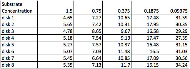
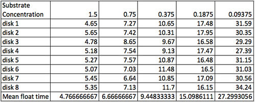
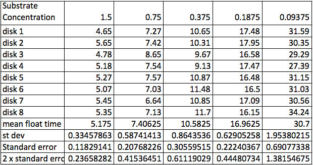
In the past, the students would record their results and graph their work in their laboratory notebooks. Later, I’d let them do their work in Excel or some other spreadsheet. The data tables and graphs were all over the map. Usually about the best the students would come up with looked something like this.
The data (although not usually, this precise) and usually not with the actual H2O2 concentrations:
Sometimes they would have a row of “average time” or mean time but I don’t think any student has ever had rows of standard deviation and for sure no one ever calculated standard error but getting them to this point is one of my goals at this point. Of course, that is going to be one of my goals at this point. As teachers we work so much with aggregated data (in the form of grades and average grades) that we often don’t consider that for many it doesn’t make any sense. Turns out to be an important way of thinking that is missing more than we realize. In fact in the book, Seven Pillars of Statistical Wisdom, Stephen M. Stigler devotes an entire chapter on aggregation and its importance in the history of mathematical statistics. For most of my career, I was only vaguely familiar with this issue. Now I’d be very careful to bring this out in discussion with a number of questions. What does the mean provide for us that the individual data points do not? Why does the data “move around” so much?
It doesn’t take much to make sure they calculate the mean for their data.
This brings up another point. Not only do some folks fail to see the advantage of aggregating data some feel that the variation we see can be eliminated with more precise methods and measurement–that there is some true point that we are trying to determine. The fact is the parameter we are trying to estimate or measure is the mean of the population distribution. In other words there is a distribution that we are trying to determine and we will always be measuring that distribution of possibilities. This idea was one of the big outcomes of the development of statistics in the early 1900’s and can be credited to Karl Pearson. Today, in science, the measurement and such assume these distributions–even when measuring some physical constant like the acceleration of gravity. That wasn’t the case in the 1800’s and many folks today think that we are measuring some precise point when we collect our data. Again, I wasn’t smart enough to know this back when I started teaching this lab and honestly it is an idea that I assumed my students automatically assimilated but I was wrong. Today, I’d take time to discuss this.
Which brings up yet another point about the “raw” data displayed in the table. Take a look at disk 3, substrate concentration 0.75%. Note that it is way off compared to the others. Now this is a point to discuss. The statement that it is “way off” implies a quantitative relationship. How do I decide that? What do I do about that point? Do I keep it? Do I ignore it? Throw it away? Turns out that I missed the stop button on the stop watch a couple of times when I was recording the data. (Having a lab partner probably would have led to more precise times). I think I can justify removing this piece of data but ethically, I would have to report that I did and provide the rationale. Perhaps in an appendix. Interestingly, a similar discussion with a particularly high-strung colleague resulted caused him so much aggravation that the discussion almost got physical. He was passionate that you never, ever, ever discard data and he didn’t appreciate the nuances of reporting improperly collected data. Might be a conversation for you’ll want to have in your class.
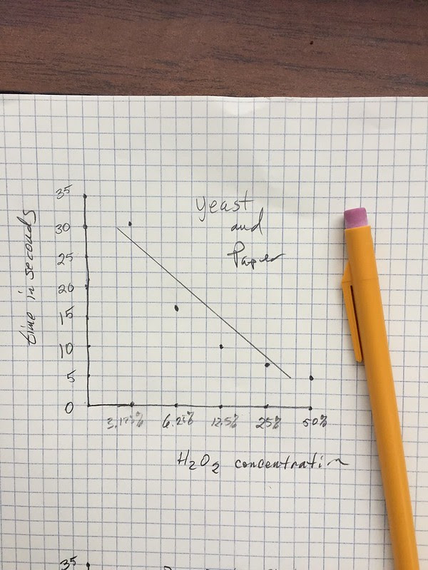
The best student graphs from this data would look like this. I didn’t often get means but I liked it when I did. But note that the horizontal axis is log scaled. Students would often bring this type of graph to me. Of course, 99% of the them didn’t know they had logged the horizontal axis, they were only plotting the concentrations of H2O2 equally spaced. I would get them to think about the proper spacing by asking them if the difference between 50% and 25% was the same difference as between 6.25% and 3.125%. That usually took care of things. ( of course there were times, later in the semester that we explored log plots but not for this lab. )
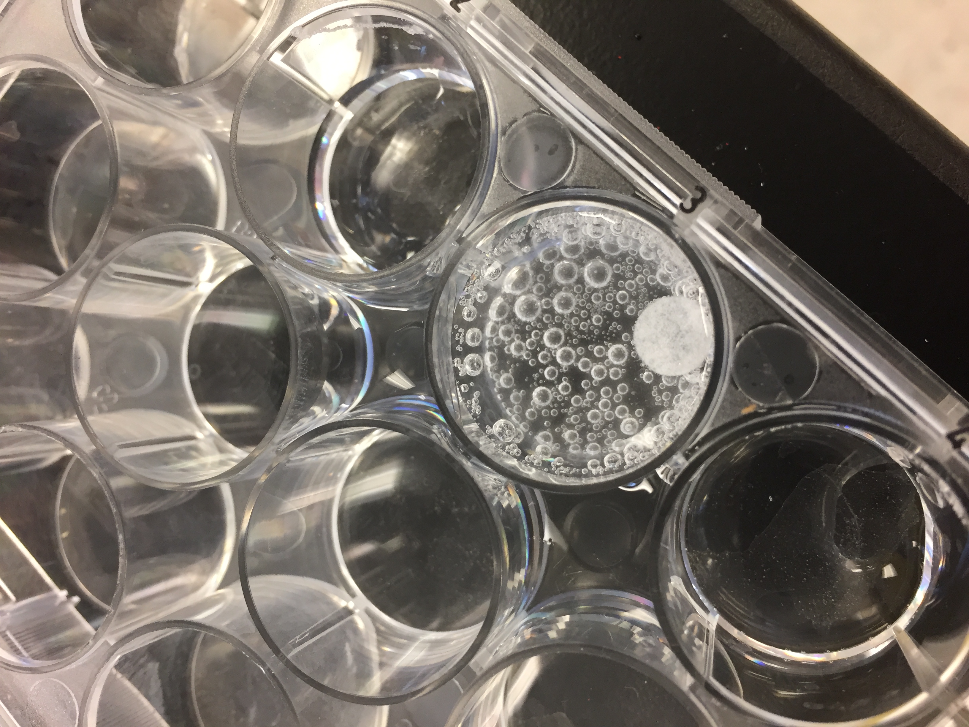
Note also, that this hypothetical student added a “best fit” line. Nice fit but does it fit the trend in the actual data? Is there actually a curve? This is where referring back to the models covered earlier can really pay off. What kind of curve would you expect? When we drop a disk in the H2O2 and time how long it rises are we measuring how long the reaction takes place or are we measuring a small part of the overall reaction? At this point, it would be good to consider what is going on. The reaction is continuing long after the disk has risen as evidenced by all the bubbles that have accumulated in this image. So what is the time of disk rise measuring? Let’s return to that in a bit but for now, let’s look at some more student work.
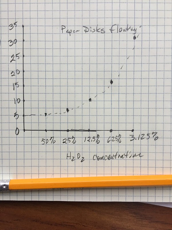
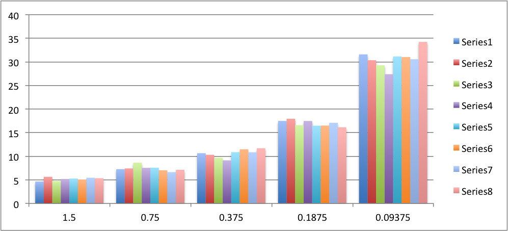
Often, I’d get something like this with the horizontal axis—the explanatory variable—the independent variable scaled in reverse order. This happened a lot more when I started letting them used spreadsheets on the first go around.
Spreadsheet use without good guidance is usually a disaster. After I started letting them use spreadsheets I ended up with stuff that looked like this:
or this
It was simply too easy to graph everything–just in case it was all important. I’ve got to say this really caught be off guard the first time I saw it. I actually thought the students were just being lazy, not calculating the means, not plotting means, etc. But I think I was mostly wrong about that. I now realize many of them actually thought this was better because everything is recorded. I have this same problem today with my college students. To address it I ask questions that try and get to what “message” are we trying to convey with our graph. What is the simplest graphic that can convey the message? What can enhance that message? What is my target audience?
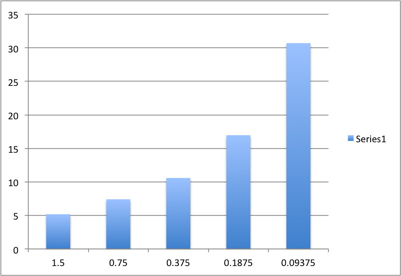
The best spreadsheet plots would usually looked something like this where they at least plotted means and kind of labeled the axis. But they were almost always bar graphs. Note the the bar graphs graph “categories” on the horizontal axis so they are equally spaced. This is the point that I usually bring out to start a question about the appropriateness of different graph methods. Eventually with questions we move to the idea of the scatter plot and bivariate plots. BTW, this should be much easier over the next few years since working with bivariate data is a big emphasis in the Common Core math standards.
But my goal in the past was to get the students to consider more than just the means but also to somehow convey the variation in their data–without plotting every point as a bar. To capture that variability, I would suggest they use a box plot–something we covered earlier in the semester with a drops on a penny lab. I hoped to get something like this and I usually would, but it would be drawn by hand.
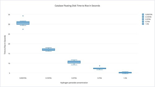
The nice thing about the box plot was that it captured the range and variability in the data and provided them with an opportunity to display that variation. With a plot like this they could then argue, with authority that each of the dilutions take a different amount of time to rise. With a plot like this you can plainly see that there is really little or no overlap of data between the treatments and you can also see a trend. Something very important to the story we hope to tell with the graph. My students really liked box plots for some reason. I’m not really sure why but I’d get box plots for data they weren’t appropriate for.
Today, I’m not sure how much I’d promote box plots but instead probably use another technique I used to promote—ironically, based on what I discussed above—plot every point and the mean. But do so in a way that provides a clear message of the mean and the variation along with the trend. Here’s what that might look like.
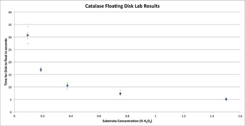
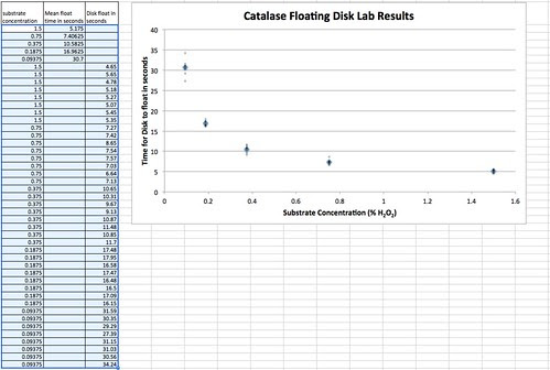
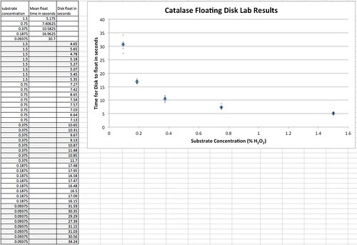
It is a properly scaled scatterplot (bivariate plot) that demonstrates how the response variable (time to rise) varies according to the explanatory variable (H2O2 concentration). Plotting is not as easy as the bar graph examples above but it might be worth it. There are a number of ways to do this but one of the most straight forward is to change the data table itself to make it easier to plot your bivariate data. I’ve done that here. One column is the explanatory/independent variable, H2O2 concentration. The other two columns record the response or dependent variable, the time for a disk to rise. One of the other columns is the mean time to rise and the other is the time for the individual disk to rise. BTW, this way of organizing your data table is one of the modifications you often need to do in order to enter your data into some statistical software packages.
With the data table like this you can highlight the data table and select scatter plot under your chart options.
At this point, I’d often throw a major curve ball towards my students with a question like, “What’s up with time being the dependent variable?” Of course, much of their previous instruction on graphing, in an attempt to be too helpful suggested that time always goes on the x-axis. Obviously, not so in this case but it does lead us to some other considerations in a bit.
For most years this is where we would stop with the data analysis. We’ve got means, we’ve represented the variability in the data, we have a trend, we have quantitative information to support our scientific arguments.
But now, I want more. I think we should always be moving the bar in our classes. To that end, I’d be sure that the students included the descriptive statistic of the standard deviation of the sample along with the standard error of the mean and to use standard error to estimate a 95% confidence interval. That would also entail a bit of discussion on how to interpret confidence intervals. If I had already introduced SEM and used it earlier to help establish sample sizes then having the students calculate them here and apply them on their graphs would be a forgone conclusion.
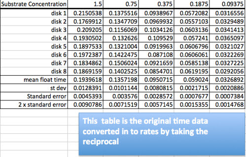
But what my real goal, today would be to get to the point where we could compare our data and understanding about how enzymes work with the work done in the field–enzyme kinetics. Let’s get back to that problem of what is going on with the rising disk—what is it that we are really measuring if the reaction between the catalase and the substrate continues until the substrate is consumed? It should be obvious that for the higher levels of concentration we are not measuring how long the reaction takes place but we are measuring how fast the disk accumulates the oxygen product. Thinking about the model it is not too difficult to generate questions that lead students to the idea of rate: something per something. It is really the rate of the reaction we are interested in and it varies over time. What we are indirectly measuring with the disk rise is the initial rate of the enzyme/substrate reaction. We can arrive at a rate by taking the inverse or reciprocal of the time to rise. That would give us a float per second for a unit. If we knew how much oxygen it takes to float a disk we could convert our data into oxygen produced per second.
So converting the data table would create this new table.
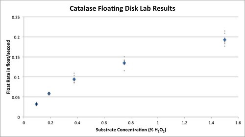
Graphing the means and the data points creates this graph.
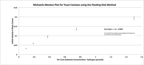
Graphing the means with approximately 95% error bars creates this graph.
Woooooooweeeeee, that is so cool. And it looks just like a Michelis-Menten plot.
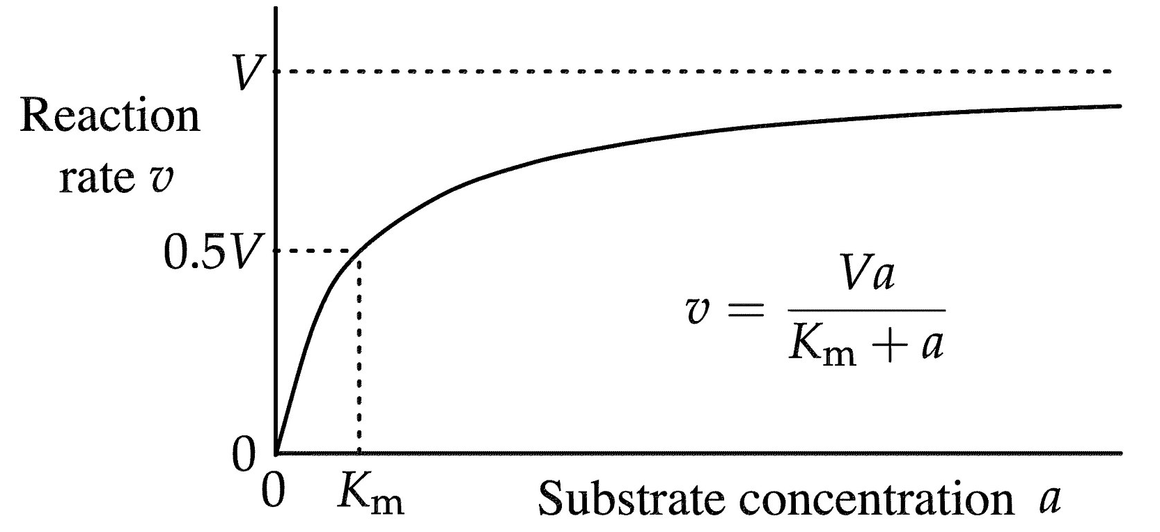
Creating this plot–as long as the students can follow the logic of how we get here opens up an entirely new area for investigation about enzymes and how they work. Note that we now have some new parameters: Vmax and Km that help to define this curve. Hmmmm. What is this curve and do my points fit it? How well do the data points fit this curve. Can this curve, these parameters help us to compare enzymes? Here we return to the idea of a model–in this case a mathematical model which I’ll cover in the next installment.

