Introduction/Background
The chi-square goodness of fit statistical test has long been the test of choice for biology educators to introduce concepts associated with statistical hypothesis testing and data analysis. Perhaps it would be better to say that for most of the last 50 years or so, if biology students applied statistical test it was likely the chi-square goodness of fit test. This test is so commonly used that sometimes biology teachers who haven’t had the chance to really build their own background have tried to use the chi-square goodness of fit test in labs or on data where it doesn’t really work. A bigger problem, though, in my mind is that we (yes, I did this too) often resort to teaching the method algorithmically. “Here are the steps, follow them, here are your results, and this is how you should interpret them.” Sometimes this is all we can get done but teaching this test as a black box and memorizing steps means that the student is not likely developing a deeper understanding of statistical inference.
This particular post is prompted by a discussion on the AP Biology Facebook group where one of the members asked about why the AP Stats folks teach chi-square so differently,
Specifically, we will use the spreadsheet to model what might happen in a theoretical situation that informs how we analyze data from a fruit fly choice chamber. Our goal is to develop a model of what would happen if each of 20 fruit flies randomly chose one side of a chamber over the other. The important thing here is that they have no preference to either side and the side chosen is just a coin flip. In fact, you could do this simulation with coins by flipping them but the computer can do it faster and analyze the data instantly. BTW, this model is actually the null model–sound familiar?
The Spreadsheet, described.
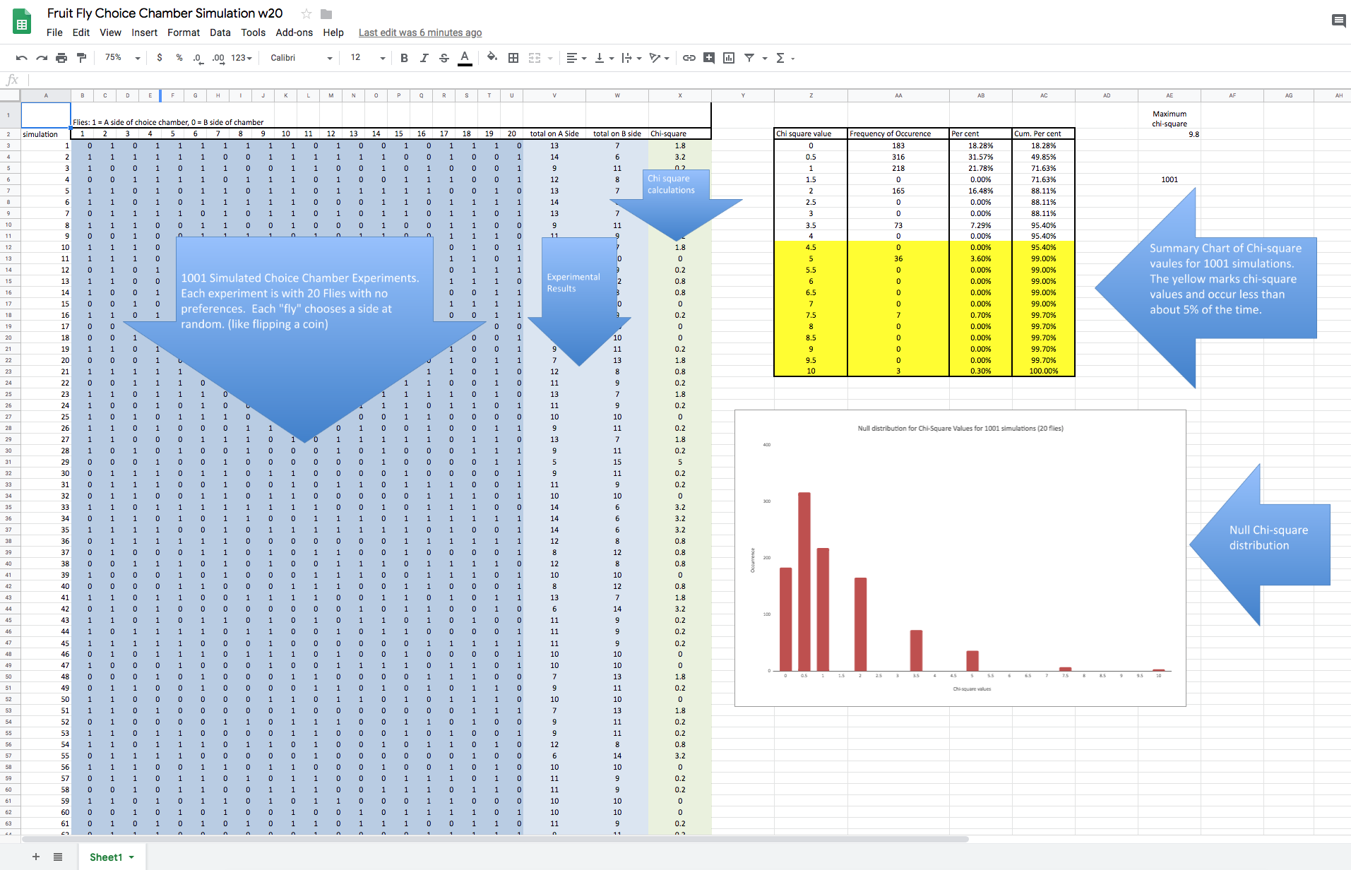
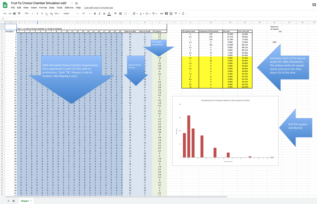
The spreadsheet is designed to simulate 1001 different choice chamber experiments involving 20 new
Each row (there is 1001 rows) of this dark blue section is one simulated experiment. Twenty “0’s” and “1’s” are randomly generated with the =Randbetween(0,1) function. Like flipping a coin. Each cell in the dark blue section is one fly. Using “0’s” and “1’s” makes tallying the score easy–just add up the row. Assign “1’s” to the “A” side of the chamber. The remaining “flies” are assigned to the “B” side. The tallies are recorded in the light blue section.
Just a heads up, we actually can evaluate this null model with just these results and we will take a look at that later, for now, if you’d like to explore that check out this video I made called Lady Drinking Tea.
The green section is the Chi-square calculation result. Note that when the “fruit flies” chose each side of the chamber in equal numbers (10 A and 10 B) that the Chi-square calculates to 0. The further the two sides are apart from each other the larger the Chi-square calculation. It is also important to note that there are 1001 simulated experiments, all with a calculated chi-square value. Even though random selection processes are the only thing happening, occasionally large chi-square values appear for some experiments. This spreadsheet lets us see if there is a pattern to these results and to approximate the probability of various chi-square values.
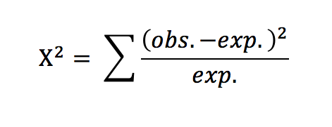
First, though, let’s discuss the test statistic known as chi-square. Not from a theory standpoint but more from a “what is going on here standpoint.” It seems to me that when we present a formula to our students it is imperative that we explain what is going or have them work it out for themselves. So how would you describe this formula? I apologize if what I’m about to write seems very rudimentary or simplistic but my experience is that while most biology teachers have taught this formula over and over, they haven’t often taken time to figure out what it provides. Well, here we go. First the numerator (that expression on the top of the fraction): (obs. – exp.)^2 Why do we do that? Get your students to answer this. The obs. – exp. should be easy. It is the difference between what we expect and what we observe. That difference can be positive or negative. If we leave it like this then these differences will eventually cancel each other out when we look at the other outcomes. We have two options: take the absolute value or square the term. Squaring removes the negative values as well. (btw, the absolute value is another option for other ways of expressing variability in data). Now, what about that denominator–that number on the bottom? Why divide the difference squared by the expected value? Honestly, for an example like the one in this spreadsheet where there are two outcomes expected and they are equal, it seems like this is not really necessary. But imagine for a moment if there were three outcomes or the expected outcomes were not equal. By dividing by the expected value for that particular outcome you are standardizing or weighing your value so the contributions of the different outcomes can be fairly considered when we add each of them up to create the final statistic. (much like taking a percentage) The chi-square statistic is simply a way of putting a number on how far off our observed values are from the expected presented in a way that fairly represents each categorical outcome. Whew….that’s enough of that. Let’s get on to the rest of the spreadsheet.
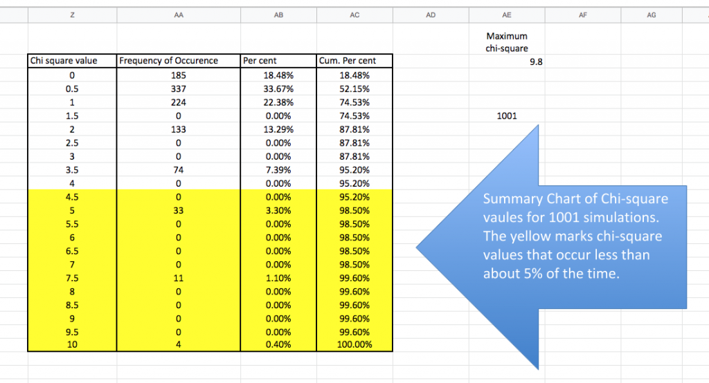
This section of the spreadsheet compiles and organizes the results of 1001 individual simulations. As I said before we could have done this simulation with some coins but it would have taken a very long time to flip the coins, to tally the results and to do the calculations as well. At this point take a moment to tell the spreadsheet to recalculate. On my Mac, you can do this with a CMD-R. I suspect a CTRL-R will work on a DOS machine. Because this is a simulation based on random numbers the entire spreadsheet—every simulated experiment changes with each recalculation. I could have made this simulation with only 100 experiments–that would have been faster but the results would vary more between each recalculation. Likewise, I could have made 10,000 rows or experiments but I imagine that would max out the browsers and my computer. (I do have an excel simulation with 10,000 rows.) Generally, if we want very precise estimates of the null distribution from our simulation then we should probably shoot for 10,000 simulations to ensure we capture some very rare events. But like all things in education, research and life, we sometimes take other things into consideration as we move forward.
The first two columns of this table compile the simulation results–how often a particular chi-square value appeared in 1001 simulations. On a rare
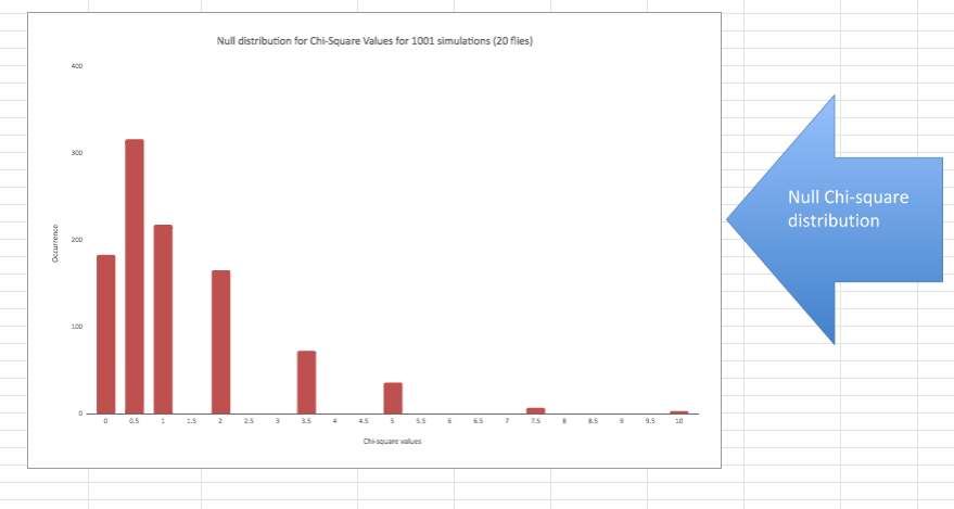
Probability/null distributions are a key component of the reasoning behind statistical inference. This graph outlines the not only the possible chi-square outcomes but how frequent each is–the entire universe of possibilities. The simulation presents a bar graph but the mathematically derived distribution would be a curved, continuous line. There are “spaces” in this distribution that are the result of using a single sample size (20) for our simulated experiments. It’s not too hard to “fill in” the missing bars. This distribution allows us to estimate how often a chi-square value of a certain size (or bigger) would happen when
I’ll end this post here, and perhaps revisit it to offer suggestions on how I have used spreadsheets like this to help my students gain insights into statistical inference. Plus, I haven’t said anything about the second bunch of tables and graphs on the sheet. My thought on this is that I think many teachers can appreciate a spreadsheet like this to help polish out their own understanding of statistical inference and by playing around a bit with this I suspect those teachers will develop new ideas on how they can best help their students gain new insights. I don’t want to overly influence that exploration just yet but don’t be surprised if I produce a couple of follow-up posts.