Background or ancient history (of course this is optional):

I first encountered BSCS curriculum materials during my student teaching experience decades ago. As a new biology teacher I was amazed and inspired by the depth of the curricula developed to not only teach biology but also how to do biology. If you were suddenly, today, “forced” to utilize only old, BSCS texts and their resources from the ‘60’s you’d find that, for the most part, you could still accomplish most of the goals set out by NGSS and the AP Biology curriculum framework. You’d just have to update content that was obviously, unknown at the time. But you’d likely be amazed at the depth, the rigor, and the clear emphasis on student centered learning exemplified by these curricula. You’ll find things like lab blocks that were designed as 9 week teaching units centered on a particular biological phenomenon. Actually, one of the BSCS texts was an entire year focused on a scaffolded series of specific laboratory research skills and questions. Sounds a bit like Project Based Learning doesn’t it? Not only that but in almost all the curricula you’ll find some interesting attempts at quantitative biology for data analysis and also for quantitative modeling. Some of the labs featured standard deviation as part of the analysis, statistical tests like t-tests and chi-square, and quantitative models that the students created themselves. Most of these quantitative skill exercises did not catch on in the community, then. I think this is largely due to the difficulty associated with this type of computationally intensive work. Remember, this was before even calculators were available. One exercise in the BSCS repertoire involved developing a mathematical model of exponential population growth. We called it the sparrow lab and we started using it in class in 1975. Calculators were still expensive and not even as available as computers are today. Still, I kept at it because of the learning opportunities presented in this lab.

The BSCS exercise was meant to be a short, one hour experience to set the stage for a week-long, wet-lab investigation into yeast population growth. The mathematical model explored exponential growth whereas the yeast lab looked at an actual population. Early in my career, I found my students were not very skilled using their microscopes and counting chambers, nor did they wish to acquire the skills. As you can imagine the challenges of the yeast populations growth led to me skipping it in later years (at least until, I actually developed and passed on some critical microbiology skills and techniques to my students, but more on that, later). The Sparrow lab, however, always delivered, in that it always helped me reach the goals I had set for my students. Of course, the primary goal was to begin to think deeply about population dynamics. But there were a number of secondary goals which included a beginning appreciation of exponential growth (something that simply takes a lot of experience with calculation before one starts to “believe” it), introduction of the idea of computational models, developing graphing skills, making sure the students found an application for some of the math they were learning, and as a side goal—introducing the students to semi-log plots. (more on these, later) That’s a lot for a short lab exercise.
The Sparrow Model: What it is and how I implemented it before computers.
I’d start the discussion with a question centered exploration of just what a population was. The goal of this discussion was to get to the idea that for biologists a population had three important properties: one: a single interbreeding species, two: a defined time interval, and three: a delimited geographic area. The questions would be very general at the beginning and move to more specific. Early questions were something along the lines of “What do you think a population is?” Naturally, my students thought in human terms so they’d answer something like, “The number of folks living in Wichita.” I’d follow up with something like, “Why did you say Wichita?” or, “Why did you say the number of people?” or “Are you talking about now or in the 1800’s?” All these questions were focused on establishing a working definition of a population.
Next the questions then went to what factors/things affect how a population grows or declines. I’d ask specifically, “What four factors affect population growth?”, knowing they would home in on density dependent factors and density independent factors that contribute to population changes. But I wanted them to think about more general population parameters that we could model more simply. Invariably, the students would first answer with “Food”, “War”, “Disease”. I’d have to suggest that they keep things like that in mind for later consideration. I’d respond by asking, “What, in a population, is affected by food availability?” or “What increases with a famine or disease?” Eventually, the students would finally get around to birth rates and death rates. Well, not exactly. They’d talks about births and deaths but not rates. We’d get to rates when we remembered that populations were defined with a time interval as well. From here, with another reminder about a geographically limited area, it was a short mental journey to including immigration and emigration.
At this point, (if they were paying attention) my students were mostly on the same page and we could then begin to think about building a model of population growth. This discussion focused on what a mathematical model was, its limitations, and its power. We would talk about simplifying complex biology in order to focus on or discover ideas that might be hard to get at any other way. We’d talk about modeling as a tool and a skill.
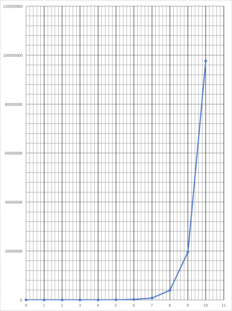
I’d usually begin with, “Let’s start with a hypothetical organism and situation that allows us to simplify birth rates, death rates and migration.” “Let’s take an imaginary organism–say a sparrow.” “How can we get rid of the whole idea of migration and only focus on death rates and birth rates? (we can come back later and consider migration). This would lead to the idea of a hypothetical island where the sparrows could live. The island was so imaginary, that we would proclaim that food was never limiting. We’d start with only 10 birds on the island, 5 males and 5 females. To this condition we added four more simplifying assumptions as suggested by the BSCS investigation that combine birth rates, death rates and eliminates migration.
- Each year each pair of sparrows would produce 10 offspring–always ½ male and ½ female.
- After the parent birds die after one year.
- All the offspring in one year live to breed the next year. (We’d spend some time discussing how the different assumptions interacted to give an overall view of population dynamics with some assumptions offsetting each other to help the model reflect real life situations.)
- During the simulation there is no migration to or from the island.
At this point I could have simply guided my students as they developed a mathematical model that incorporated these assumptions. Shoot, if I were really shooting for maximum open-endedness I could have had them come up with the assumptions. However, this exercise throughout most of my career was their first attempt at any kind of modeling. Plus as you well know, many students act like they have never had a math class in their life once you start asking them to develop a math approach to solving a problem. For these reasons I kept the exercise pretty structured. Later in my career when computers were available I opened things up considerably but that is for a future post.
With the assumptions in place, I now have each student create a table with 11 rows and 3 columns. It looks something like this
| year | population | pairs | offspring |
| 0 | |||
| 1 | |||
| 2 |
And so on to:
| year | population | pairs | offspring |
| 10 |
We work the first couple of rows as a class. The conversation might go something like this. (I have removed the annoying questions about “Can we use our calculators?”
“How many for the starting population?”…. “10.”
“O.K. then lets put ‘10’ under population.”
“How many pairs is that?”… “5.”
“Excellent, enter that under pairs”
“How many offspring will be produced?”…. “5 x 10 or 50”
“O.K., put 50 under offspring”
“Remember that all the parents from year 0 die before year 1. How many birds should we enter for the population at the start of the year?”… “50”
“Excellent. Can you fill out the rest of the chart?”
With an affirmative answer the students work to complete the table. The students were always amazed at how fast this simulated population grows and I was always amazed at how much trouble some would have trying to complete this table. Their surprise, is important because as a species we don’t really have an built-in understanding of exponential growth. To really understand it, it is imperative to make the calculations ourselves. At this point, I’d often start a side discussion on “believing numbers” and how most of us don’t. If we did, then we’d all start an investment account early in life so that it would grow. (more on this later, but again I’m trying to help them develop an appreciation for exponential growth.)
Once they have completed the table the next step is to graph the growth of this population over the 11 years with population on the y-axis and years on the x axis. I always remind them to properly scale their graph and include all the data points. I have them do this graph by hand (even once computers became available.) At this point, the exercise is always pretty fun for me–and not so much for them. Invariably, they create an improperly scaled graph that they struggle to fit on one piece of paper. This leads to a lot of discussion on producing a graph. They have to really come to terms with these huge numbers and what they really mean. Most years I would have them recreate their graphs by taping enough pieces of paper together to create a proper scale. For most scales, that required 7 or 8 pieces of paper taped together. It made quite an impression. The class time would usually be up at this point.
For homework, I asked them to use their graphs to predict the population at 20 years or twice as long. I also asked them to be thinking about what they learned from the model about populations and also to write down some unrealistic characteristics of the model output. What were its limitations? How could we change the model to account for the shortcomings? Of course, trying to answer these questions created some issues. I need to be clear. Although I assigned these questions, I didn’t really expect the students to be able to come up with good answers. I knew that they would most likely give up before any substantial insights were made at home but I did want them to struggle a bit. I wanted the challenge to percolate in their head. I think such pondering is essential to deep learning. On top of that, it helps to prepare the mind to recognize and value an elegant solution to a challenge. It’s all about trying to keep in the balance known as FLOW. https://en.wikipedia.org/wiki/Flow_(psychology)
As an extension to the homework assignment, I’d assign groups to create tables of data that included migration in the model or somehow changed the other assumptions. Naturally, they were expecting some sort of migration to have a big outcome but they were always surprised. We let the numbers do the talking and didn’t graph they model modifications. Before computers, it was easier to generate the table than to make the graph for most students. This side exploration re-emphasized the role of exponential growth factors in population growth.
Hopefully at this point they are beginning to appreciate a little bit about the nature of exponential growth in populations. My goal now is to introduce a new tool to deal with the math and also to explore how to incorporate other factors into the model. With the difficulty graphing an exponential function firmly in their brain, I introduce them to logarithms and semi-log paper for graphing purposes.
Introducing Logarithms and semi-Log graph paper
Very few times in my career would a student enter my class with an understanding of logarithms. And not having a background in teaching math, I had to cobble together some introductory lesson components in an attempt to make logs accessible. That was one challenge. The more difficult challenge was trying to motivate the students into working on math outside of the math classroom. But I had a miniscule bit of student interest to use as a seed to get them past their math phobias—“What if I can make graphing this data easier in the long run?”
To introduce Logs, I’d first write out a column of numbers something like this:
- 1,000,000
- 100,000
- 10,000
- 1,000
- 100
- 10
- 1
I’d ask them to put this in their notebooks but also add another column that expressed the same number as powers of 10. Most could do this once you got them started or if you let them work together.
1,000,000 10^6
100,000 10^5
10,000 10^4
1,000 10^3
100 10^2
10 10^1
1 10^0 (o.k. I admit, I usually had to help them with this one. )
Generally, I’d have to ask for patience at this point since they didn’t really see a connection except that I had large numbers here and their table also had large numbers. To move forward, I’d ask the question: “ So what is 1 million multiplied by 1 thousand?” Amazingly starting in the 90’s my students would immediately turn to their calculator to answer this question. Prior to that time, most of my students could answer this with some mental math. They would simply “count zeroes” to get 1 billion or 1,000,000,000 or 10^9.
Since few remembered rules about exponents we would point their thinking to thinking in exponents. 10^6 x 10^3 = 10^9. Hmm…what rule would describe how to multiply powers of ten? Obviously they come up with, “Add the exponents”. We’d run through a couple of examples to confirm the rule and then try the reverse: division. Good stuff and they were starting to buy in at this point. This buy-in allowed me to introduce the idea of what if we just graphed exponents instead of the actual numbers on the y-scale. In other words, let the exponents represent the number in question—“As long as we understand they are exponents isn’t it easier to write a “9” than 1,000,000,000 to represent a billion?” Generally, the students would answer in the affirmative but also point out that, the strategy only works for specific numbers with zeros for place holders. Usually, someone in the room would point out that others numbers could be represented using exponents that were fractions or decimals. For example: 10^1.3 is approximately equal to 20. From here we’d summarize up with a definition of logs. If a student didn’t come up with this, I’d ask questions to guide them to this point.
Now, as a biology teacher, you may be questioning whether or not biology students would actually explore math concepts like this but I seemed to have pretty good success with this approach. Naturally, not all the students engaged with this reasoning but most did and many seemed to have epiphanies like, “Oh, now I understand logs.” Or “Why didn’t they teach like that in math class?” Let me be clear, that had they not previously covered some of these topics in math class it would have taken me longer but this type of “review” seemed to be well worth the time in my opinion.
At this point, it is time to introduce semi-log graph paper. I would hand out sheets of 7 or 8 cycle semi-log paper to everyone. Naturally, they’d think I’ve gone a bit crazy and am about to do some more math torture. I had to be careful at this point to not over do it. But I challenged them to think about how they might use this to graph the population data. “What is up with this y-axis?” “Could you plot logs here?” “What is an order of magnitude?” How would you plot 50 on this graph?” I explained that the difference in spacing on the vertical axis was calculated using logs base 10. In effect, we could plot numbers by plotting their logs.
Just in case you want to print your own semi-log paper
I’ve created some semi-log paper for you if you want to have your students try graphing by hand.
This could really save some time but perhaps you want graph paper without labels. You have to decide how deep you want to explore but I’d suggest having the students fill out semi-log graph paper by hand has some benefits later on when students are trying to interpret semi-log plots.
http://www.bradwilliamson.net/wp-content/uploads/2019/02/8-cycle-semi-log-without-labels.pdf
It usually took a few missteps before folks get the hang of graphing these population numbers so I had the students mark data points in pencil so they could be corrected. It took more than a little struggle to learn how to actually plot numbers when the y scale was exponents or logs. Some would realize pretty quick that the curved, j-shape line that they had plotted on regular graph paper (which was very difficult) was actually a straight line on the semi-log paper. They liked that they could connect the points with a ruler.
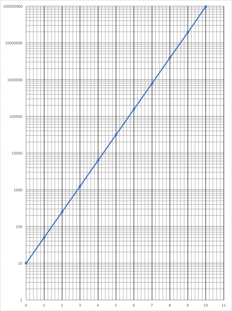
Once a semi-log plot was produced, like this one, I’d ask the students to tell me what they thought were the advantages and disadvantages of such a plot. This line of questioning often fell flat so I’d have to add a few more questions to help generate some response. For example, “If I had 12 cycle log paper how would you predict the size of the population in year 12?” I’d ask if they had ever seen a graph like this before. And naturally, most had not. We would then have a discussion about how important it was to pay attention to the scale and that if it were a semi-log scale then a straight line plot was really an exponential plot. “Could folks get confused?” The obvious answer was, “yes”. But that led to discussion on how they might work to not be confused.
Conclusion
This is the challenge of working with quantitative ideas in biology. As biology teachers, our students, their parents, and our administration typically don’t expect us to be applying mathematical concepts to our content and it takes some getting used to. Some fight to the end but I can unequivocally state that many students who struggled in their math classes told me that they had finally got an idea about a particular math concept. I didn’t reach all of them but I reached enough to convince me it was worth the time. And for this lab, I always felt that the return in student learning was worth the 2-3 days of time invested.
This entire procedure changed the day I was able to finally round up enough classroom computers for the students to work on. That’s coming up next.